Color Psychology for Homes: Why Color Consultations Matter
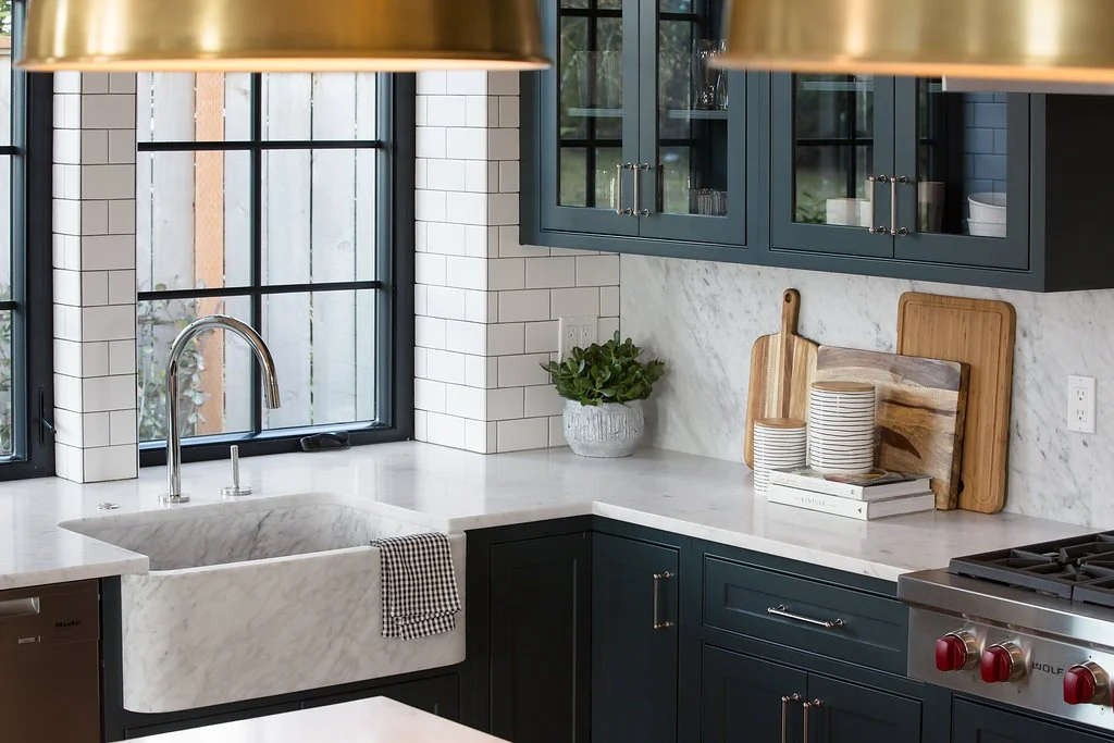
Your space is prepared to be repainted, renovated, or even just refurnished, but you’re hesitant to start the project. You want the best for your space, but now you’re surrounded by paint samples and wondering how to find the right fit.
A home color consultation offers a solution that puts the excitement back into designing. Color psychology for homes is more than decoration; it’s strategy. The colors of your home influence the mood and energy of your space.
This guide walks you through how professional designers use color psychology in design choices and how their advice can help you create an ideal, cohesive interior.
What Is Color Psychology?
Simply put, color psychology explores how human moods, feelings, and behavior are affected by the different colors that surround us.
How Color Influences Emotion and Perception
Based on learned and biological associations, your choice of color, or combination of colors, signals different emotional and physiological responses. For example, reds typically energize the heart rate, while blues calm us down.
Interior Designers Think Beyond Paint Swatches
More than just the color of a space, interior designers consider the intention of a room, the size limitations, and prospective color choices to create a space that feels purposeful and complete.
The Psychology of Color in Interior Design
Color psychology for homes thinks further than the name of a color. It considers the tone, temperature, and even the effects of lighting on the palette of a room.
Warm Colors vs. Cool Colors
On the warm end of the spectrum are reds, oranges, and yellows. These colors are known to liven and visually expand a space, spurring energy and excitement. On the other side, blues, greens, and purples are known as cool colors, used to bring calm, relaxation, and focus.
How Saturation and Brightness Affect Mood
Colors of higher saturation (intensity), like pure yellows, increase positive moods and emotions. Lower-saturated, greyish colors decrease energy. The same applies to the brightness of a color. Bright colors heighten mood and dim colors dampen it.
Why Lighting Changes Color Throughout the Day
Darker, dimmer colors will absorb light, while brighter, lighter colors will reflect it. Throughout the day, different rooms receive different amounts of natural light, changing the way colors in the room appear.
Understanding Color Theory for Homes
Interior designers often use color theory with color psychology for homes to understand and control the perception and feel of the space in a room.
What Is Color Theory?
Color theory examines how different colors interact with each other in the same context. In other words, it is a kind of behavior analysis on color, used to determine which colors will get along and which will likely clash.
Common Color Theory Terminology
The Color Wheel: a tool used to define the relationships of colors
Complementary Colors: colors across from each other, high in contrast
Analogous Colors: colors next to each other, harmonious
The Difference Between Undertones and Surface Color
Surface color is the main color you see in your color palette. Undertones are subtle, typically muted colors that are hidden beneath the surface, working to make the surface color stand out.
How Different Colors Affect Mood in a Home
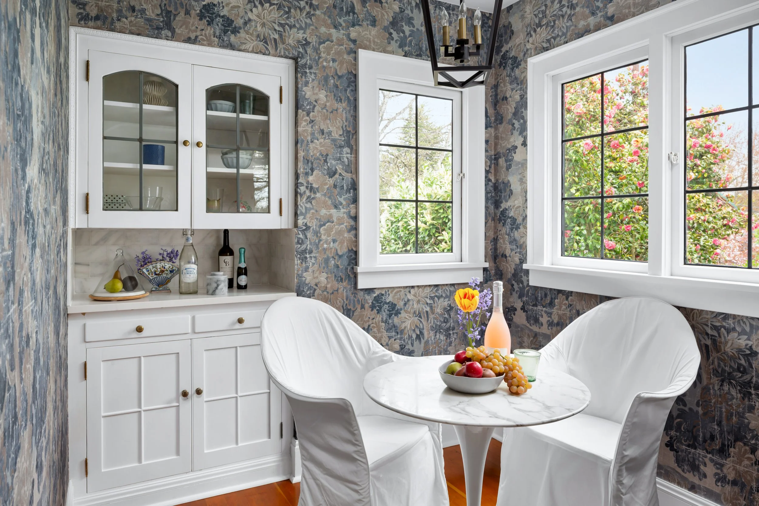
From vibrant reds to deep, cool blues, color psychology for homes means choosing paint colors that create the mood of your space.
Blues: Calm and Relaxation
Dusky and bright blues alike provide your home with a sense of calm and tranquility. This color is often used in spas and medical centers for this reason.
Greens: Balance and Restoration
The color most common in nature, green reflects a feeling of harmony and healing. Lighter greens are chosen to balance the mind, while deeper greens imbue a sense of protection and comfort.
Warm Neutrals: Comfort and Softness
Choosing to layer a room with different shades of warm neutrals, like soft caramel or warm beige, provides your space with an air of relief and coziness.
Whites: Clarity and Openness
Shades of white are often underused in interior design. Applied correctly, these shades can open up your space and provide a clean, breathable atmosphere.
Dark Colors: Depth and Sophistication
Royal purples and rich charcoals, for example, declare themselves as focal points in your space, adding layered depth and an overall feel of luxury to the common room.
How to Use Color Psychology in 5 Different Rooms
Each of the rooms in a home has a different use and intention behind it. Professional color psychology for homes considers this when deciding the palette of a space.
#1: Bedroom: Creating a Restful Retreat
Grays and light blues in the bedroom help to improve sleep quality while bringing the space tranquility. The inclusion of dark colors can give your bedroom a feel of intimacy.
#2: Living Room: Warmth and Connection
A combination of balancing neutrals and cool tones for relaxation with accents of oranges, which energize conversation, is ideal to create a warm and inviting communal space.
#3: Kitchen: Energy and Light
As the heart of the home, the colors in your kitchen should fuel the space. Yellows and bright whites, but also natural greens, make a kitchen feel inspiring and alive.
#4: Home Office: Focus and Productivity
Blues and greens in a home office encourage focus and concentration. If your home office is more of a creative space, orange and yellow tones can be chosen to help to stimulate creativity.
#5: Bathroom: Calm and Simplicity
Bathrooms are spaces for wellness, but also consider relaxation. Pale-colored tones work to boost both of these factors while keeping the space clean and breathable.
The Most Common Paint Color Mistakes Homeowners Make
From clashing colors to forgetful details, mistakes in choosing paint colors can be easy to come by, but color psychology for homes can make them easily avoidable.
Mistake #1: Ignoring Undertones
A solid foundation made of undertones heavily influences your space. It can be a simple mix up of choosing grey over beige that leaves your rooms feeling cold without meaning to.
Mistake #2: Choosing Colors Without Testing Lighting
The industrial lighting of paint stores makes every paint color look different. Not considering the natural and recessed lighting of your home can drastically change the intended look of your paint.
Mistake #3: Using Too Many Competing Colors
Including too many colors in your space can leave it feeling muddied and overwhelming instead of stylish and intentional.
Mistake #4: Following Trends Without Considering the Home
Color psychology for homes is different for every house. It is important to consider your own style and space limitations instead of following trends that may not suit your space.
How Designers Build Cohesive Color Palettes
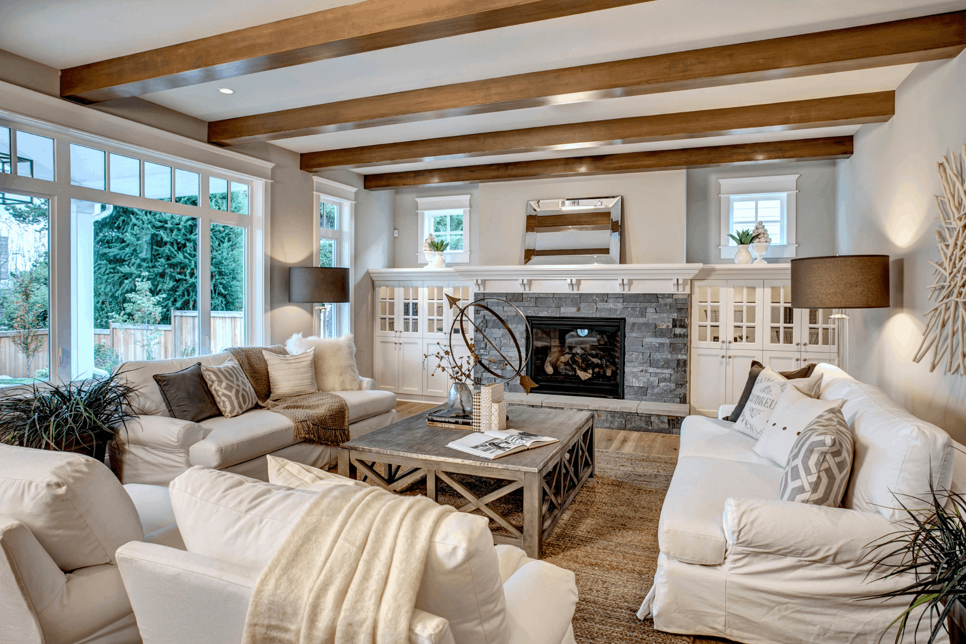
Color psychology for homes used by interior designers is based on look, strategy, and even some formulas.
The 60/30/10 Rule Explained
The 60/30/10 rule is a simple rule that states 60% of your space should be a dominating color, with 30% a secondary color, and 10% of your space left for accent colors.
The 3-Color Rule in Interior Design
Interior designers implement the 3-color rule, which implies that limiting your space to three colors allows depth and interest without any overwhelm or unintentionality.
Creating Harmony Between Rooms
Color psychology for homes considers each room as its own space, but also works with undertones and accents to create a flow that extends throughout the home.
Professional Color Consultations Are Totally Worth It!
From avoiding costly mistakes to whole-home cohesion, professional color consultations make home design easy and efficient.
Avoiding Expensive Paint Mistakes
DIY paint mistakes can often be costly and frustrating; professional design advice helps you avoid the headache and put the fun back into designing
Coordinating Paint With Fixed Finishes
Professional color consultations and color psychology for homes, through intentional paint choices, create greater ease in deciding on light fixtures, brick and wood accents, and ceiling options.
Creating a Whole-Home Color Story
For each level of the home and for each room, professional color advice helps create a home with connected spaces that talk to each other.
Color Psychology for Homes: Frequently Asked Questions
What is color psychology in interior design?
Color psychology for homes means considering the biological and learned associations of colors to create a space with an intentional feel.
What colors make a home feel calm?
Cool tones and warm neutrals work well together to increase calm, balance, and relaxation in the home.
What is the 60/30/10 rule in decorating?
Aimed to build harmony, the 60/30/20 rule states that the palette of a room should be 60% dominant color, 30% secondary color, and 10% accent color.
How do undertones affect paint color?
Undertones subtly contrast or blend into the main color of the room in order to bring it emphasis or to dampen it.
What colors increase productivity in a home office?
Pale blues, greens, and violets, matched with neutral undertones, are best for encouraging productivity in a home office.
Work With Seattle Swank for a Professional Color Consultation
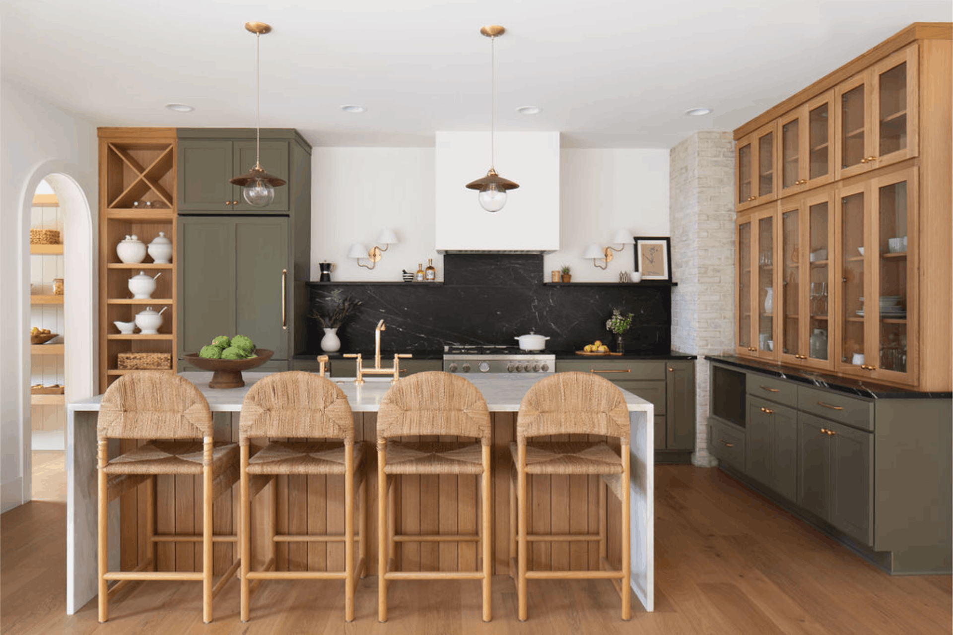
Seattle Swank creates cohesion and beautiful home design that is accessible and attainable. We believe that luxury and livability should be designed into every home. Work with us today to see how our color psychology for homes can bring out the best of your space.